

Colorful appliances are trending in India because homes are becoming expressions of identity, not just spaces of utility.
Younger buyers want personality, visual warmth, and emotional connection in everyday objects. Appliances are no longer hidden. They are designed to be seen, matched, and remembered.
When did appliances stop being invisible?
Walk into a modern Indian kitchen today.
The microwave is not tucked away anymore.
The refrigerator is not just white.
The washing machine is not just functional.
Everything is… intentional.
A yellow microwave sits on the counter. A pastel blue fridge blends with cabinetry. A dusty pink washing machine stands out against neutral tiles.
This is not accidental.
It is a shift.
Homes are no longer built around appliances. Appliances are now chosen to fit the story of the home.
The real shift is emotional, not visual
For years, appliances were designed for one thing. Function.
White. Silver. Black.
Safe choices. Predictable outcomes.
But something changed.
- Indian homes got smaller but more personal
- Social media made interiors visible
- Younger buyers started making independent decisions
And suddenly, utility alone felt incomplete.
People don’t just ask:
- “Does it work well?”
They also ask:
- “Does it feel right in my space?”
That is the real reason colorful appliances are trending in India.
Because function solves a problem. Design creates attachment.
Why are Indian households choosing color now?
Let’s break this into decisions, not trends.
One option is to stay neutral
- White, grey, black appliances
- Easy to match
- Safe across interior styles
Cost: Predictable, but forgettable
Benefit: Minimal risk
The second option is subtle color accents
- Soft pastels
- Light blues, peaches, sage greens
- Blends with modern minimal homes
Cost: Slightly harder to coordinate
Benefit: Adds warmth without overpowering
The third option is bold expression
- Bright yellows, oranges, blues
- Appliances become focal points
Cost: Requires confident styling
Benefit: High visual impact and personality
Most Indian homes are moving from option one to option two.
And a growing segment is jumping straight to option three.
Because safe design is invisible. Expressive design is memorable.
What changed in how Indian homes are designed?
The biggest shift is this:
Homes are no longer designed for guests. They are designed for daily life.
Earlier:
- Formal living rooms
- Hidden kitchens
- Appliances behind doors
Now:
- Open kitchens
- Multi-use spaces
- Appliances in plain sight
When something becomes visible, it becomes design.
And once it becomes design, color becomes inevitable.
The Instagram effect is real
Scroll through any home decor feed.
You will notice patterns:
- Bright kitchen corners
- Styled countertops
- Appliances that look like decor pieces
This is not just aesthetic.
It is behavioral.
People are designing spaces they enjoy using. Not just spaces that look clean.
A colorful appliance changes how the space feels.
And feeling drives usage.
Color reduces friction in daily life
This sounds abstract. It is not.
Think about this.
It is 8:30 pm. You are tired. You walk into the kitchen.
Everything looks the same. Neutral. Functional.
Now imagine the same space with a bright, cheerful appliance.
A yellow microwave. A pastel blue kettle.
Something shifts.
Energy.
It feels lighter. Easier.
This is not about design. It is about psychology.
- Bright colors trigger positive emotion
- Positive emotion reduces perceived effort
- Reduced effort increases usage
Good design does not just look better. It makes everyday tasks feel easier.
Why brands are investing in colorful appliances
Because demand changed.
And smart brands follow behavior, not tradition.
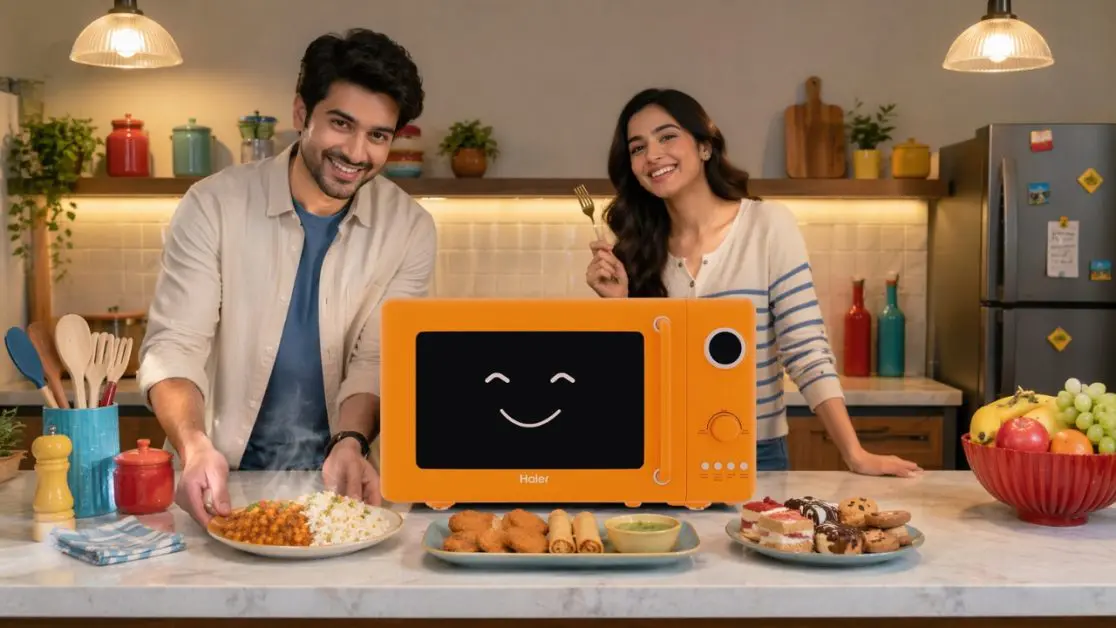
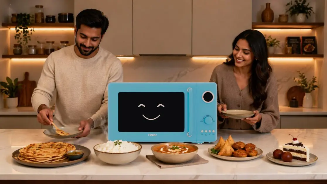
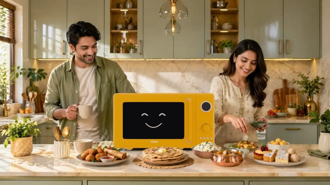
Take something like the Haier Vogue microwave series.
Instead of one standard finish, it offers multiple color options like yellow, peach, and blueberry blue.
That is not just design.
That is a system decision.
- Different homes, different palettes
- Different users, different preferences
- Same functionality, multiple expressions
When choice increases, ownership feels personal.
What colorful appliances actually solve
Most people think color is cosmetic.
It is not.
It solves three very real problems.
1. Identity problem
Modern buyers want their space to reflect them.
Color enables that.
2. Visual fatigue problem
Neutral interiors look clean. But over time, they feel flat.
Color breaks monotony.
3. Engagement problem
Appliances are used daily.
If they feel good to use, they get used better.
How to choose the right color for your home
This is where most decisions go wrong.
People choose color in isolation.
But color is contextual.
Here is a simple decision table
| Home Style | Best Appliance Color Strategy | Why It Works |
| Minimal / Neutral | Pastels (blue, peach, mint) | Adds warmth without disrupting balance |
| Modern Modular | Bold accents (yellow, orange) | Creates focal points in clean spaces |
| Traditional Indian | Warm tones (peach, earthy shades) | Blends with wood and textured surfaces |
| Compact Urban | Light colors | Makes space feel bigger and brighter |
Color works best when it complements, not competes.
Are colorful appliances just a passing trend?
This is the wrong question.
The right question is:
What does this trend reveal about how people live?
And the answer is clear.
- People want control over their environment
- People value aesthetics as much as utility
- People want products that feel personal
These are not trends.
These are shifts.
And shifts do not reverse easily.
The hidden system behind this trend
Every major change in consumer behavior follows a pattern.
- Function becomes standard
- Differentiation moves to experience
- Experience evolves into identity
Appliances have already passed stage one.
Most products today work well.
Now the competition is in stage two and three.
- How does it feel to use it?
- How does it look in my space?
- Does it feel like “mine”?
Color answers all three.
Where Haier fits into this shift
Haier’s approach is interesting because it does not treat color as decoration.
It treats it as integration.
Take the Haier Vogue 20L Solo Microwave Oven series:
- Multiple color variants for different kitchens
- Smiley glass door design that adds personality
- Digital display and auto cook menus for ease of use
This combination matters.
Because design without utility is decoration.
Utility without design is forgettable.
The intersection is where products become part of life.
The real reason colorful appliances are trending in India
It is not about color.
It is about control.
Control over:
- Space
- Mood
- Identity
- Daily experience
Color is just the visible layer.
The real change is invisible.
People are designing how they want to feel at home.
What this means for how we choose appliances
The old way:
- Compare specs
- Compare price
- Pick the best deal
The new way:
- Does it fit my space?
- Does it fit my routine?
- Does it feel right every day?
Specs matter.
But experience decides.
A simple framework for making the decision
When choosing an appliance, think in three layers:
1. Function layer
- Capacity
- Power
- Features
2. Ease layer
- Controls
- Speed
- Automation
3. Experience layer
- Design
- Color
- Emotional feel
Most people stop at layer one.
Smart buyers go to layer three.
The takeaway
Colorful appliances are not about being bold.
They are about being intentional.
A yellow microwave is not just a color choice.
It is a statement about how you want your space to feel.
A pastel appliance is not subtle.
It is deliberate calm.
Design is no longer the final step. It is the starting point.
And once you see it this way, every appliance decision changes.
Because you are not just buying a machine.
You are shaping a daily experience.
Frequently Asked Questions
I’m overwhelmed with choosing appliances. Should I just stick to white or try color?
If you want zero risk, white/grey is safe. But it often becomes invisible over time.
Color adds emotional value. Even a soft pastel can make your space feel more intentional without overwhelming it.
Will I get bored of a colorful appliance after a few months?
Unlikely if you choose correctly.
Boredom usually comes from mismatch, not color itself. When the color fits your environment, it keeps adding subtle emotional lift instead of fatigue.
Do colorful appliances look dirty faster than white ones?
Not necessarily. In fact:
White shows stains and yellowing over time
Dark colors show dust and fingerprints
Mid-tones (peach, blue, mint) often hide wear better
Is paying extra for a colorful appliance actually worth it?
If it improves daily experience, yes.
You use appliances every day. Even a small emotional uplift compounds over time.
Are colorful appliances just aesthetic, or do they actually improve usage?
They influence behavior:
Bright colors → positive emotion
Positive emotion → lower resistance
Lower resistance → more consistent use
So yes, they indirectly improve usage.
Why are brands suddenly focusing on colors now?
Because function is already standardized.
Now competition is about:
Experience
Identity
Personalization
Color is the easiest way to deliver all three.